Sell on Wish Drafts - A draft feature to facilitate product uploads and help sellers list products at their convenience
Overview
Time
2 weeks
Team
Nikita T, Michelle Je (UX Writer), Raghu K (PM)
During my time at Wish, I worked on the Wish Local team for projects that were both consumer and store-facing. One of the projects I got to work on was for the store-facing Wish app, where sellers are able to upload products and manage inventory. I was the lead and sole designer for this project and I worked in close collaboration with my cross-functional partners to bring the idea to fruition.
The Problem
On the Wish store-facing app, the drop-off rate after a seller visits to product upload page is 80%.
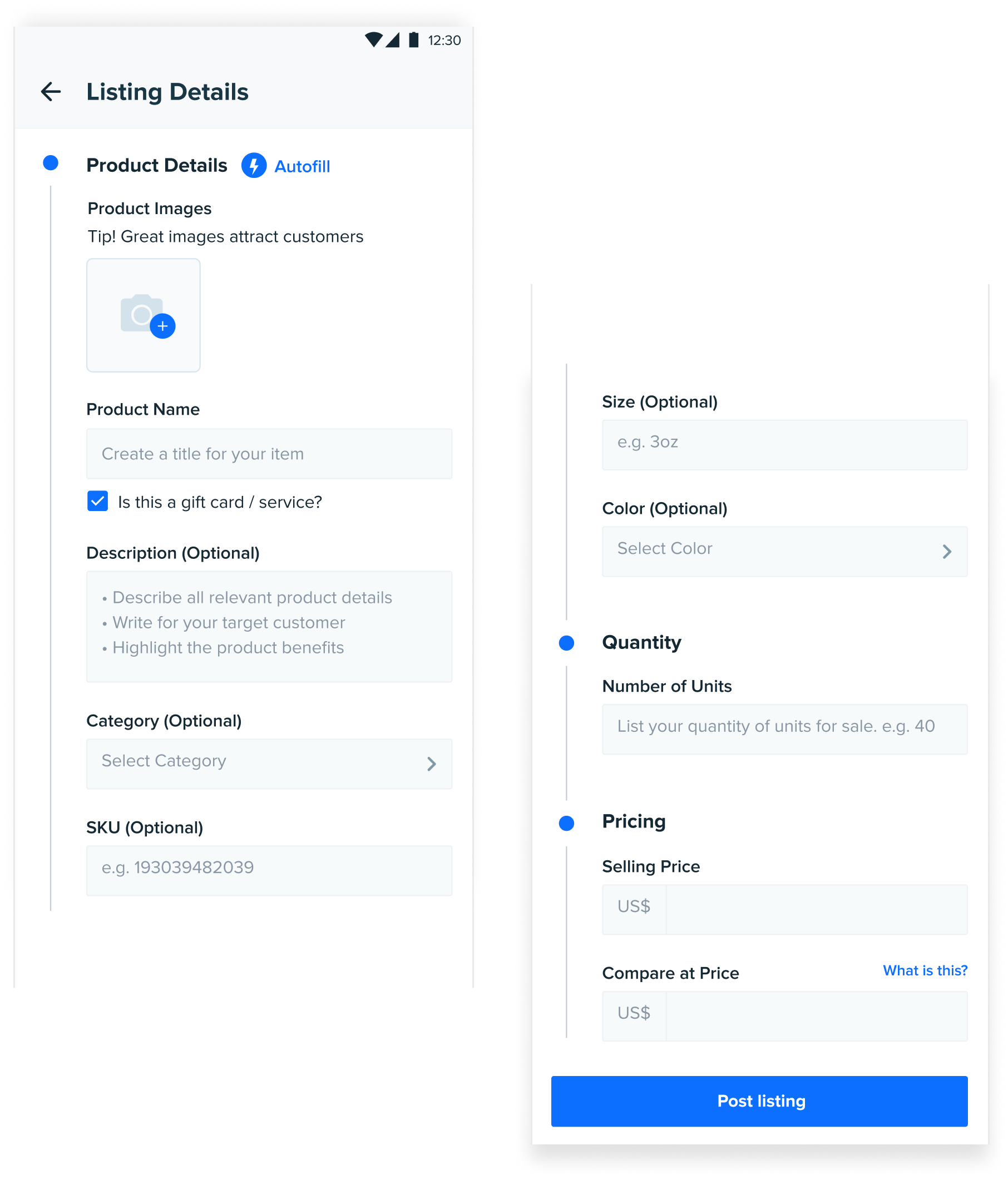
In the current workflow of uploading a new product, sellers cannot save their progress and resume later. Requiring them to complete their listing in one sitting or discard the unfinished listing and start from scratch later.
Reasons for the high drop-off rate
Gathering feedback from our existing sellers, we learnt sellers feel current product upload process is complex and is one of the reasons why product uploads/listings are low. Some of a few possible reasons for this high drop-rate include:

DESIGN GOAL
Respect and adapt to sellers’ context and workflow, making it convenient for them to upload their products on Wish
After doing a competitive analysis on products like Shopify, Ebay, Etsy, Dropbox, and Google Docs, it became clear that a draft feature is a common practice for filling out long forms and it is a basic usability expectation. Which led us to the hypothesis:
HYPOTHESIS
Introducing a draft feature should reduce the drop off rate during listing creation and help drive more product uploads
SUCCESS METRICS
1. Decrease % of drop-off during the upload listing flow
2. Increased number of products uploaded to Wish

Going into ideation, I had the following how might we questions in mind that I wanted the designs to address:
1. HMW inform existing and new sellers of the draft feature?
2. HMW reassure sellers that their progressed is saved?
3. HMW incentivize sellers to complete their drafts?
The Proposal
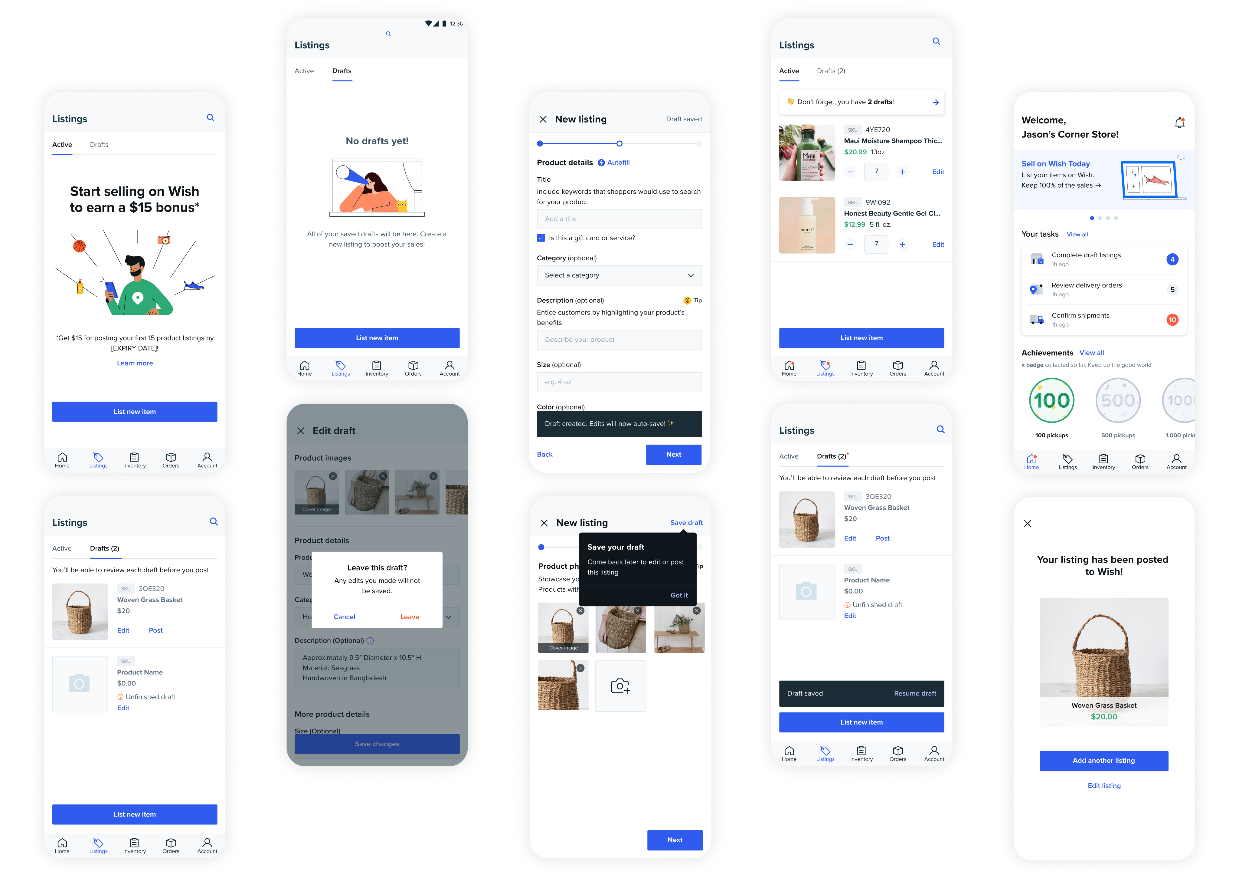
Wish sellers are able to create drafts of their listings wherever they are in the product upload flow, at the convience of their workflow.
DESIGN CONSIDERATION
Autosave vs Save button
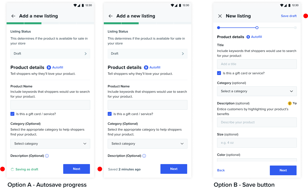
As the goal of drafts is to facilitate the product upload process, I explored the idea of having drafts be automatically saved, as soon as any product information gets input.
After discussions with the engineering team and we settled on the idea of asking users to initially click on “Save Draft” to confirm their intent, with subsequent edits being autosaved. This sets up clear user expectations, detailing each step of the way, and we’re also avoiding the product list page from being flooded by unintentional drafts.
DESIGN CONSIDERATION
2 tabs vs All products tab
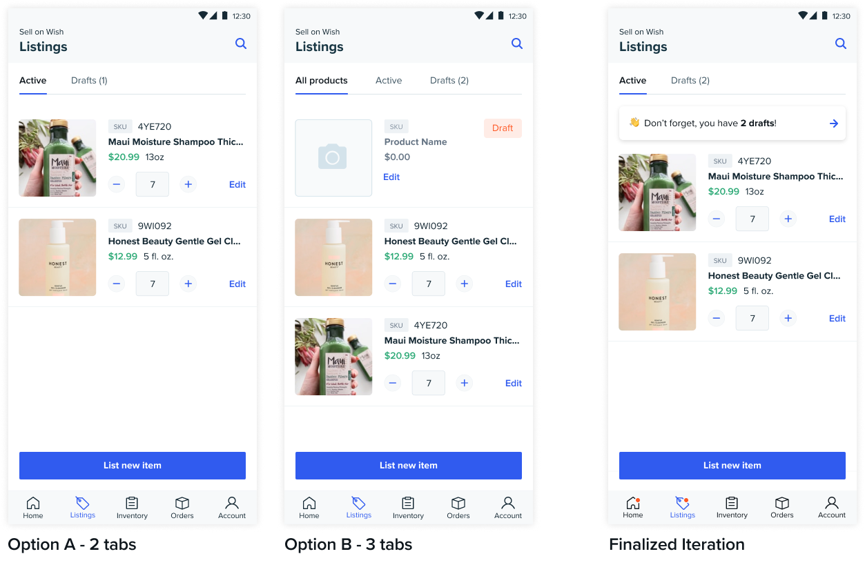
As this is strictly a mobile experience, I had to ensure efficient organization of the listings tab to make it easily scannable for sellers.
The 2 tab design made a clear distinction between active and draft listings. However, drafts tab would have a high chance of being overlooked, requiring an addional click. The issue is addressed in the 3 tab design where drafts are displayed more prominently.
We proceeded with the 2 tab design with a banner CTA, nudging sellers to complete their drafts.
DESIGN CONSIDERATION
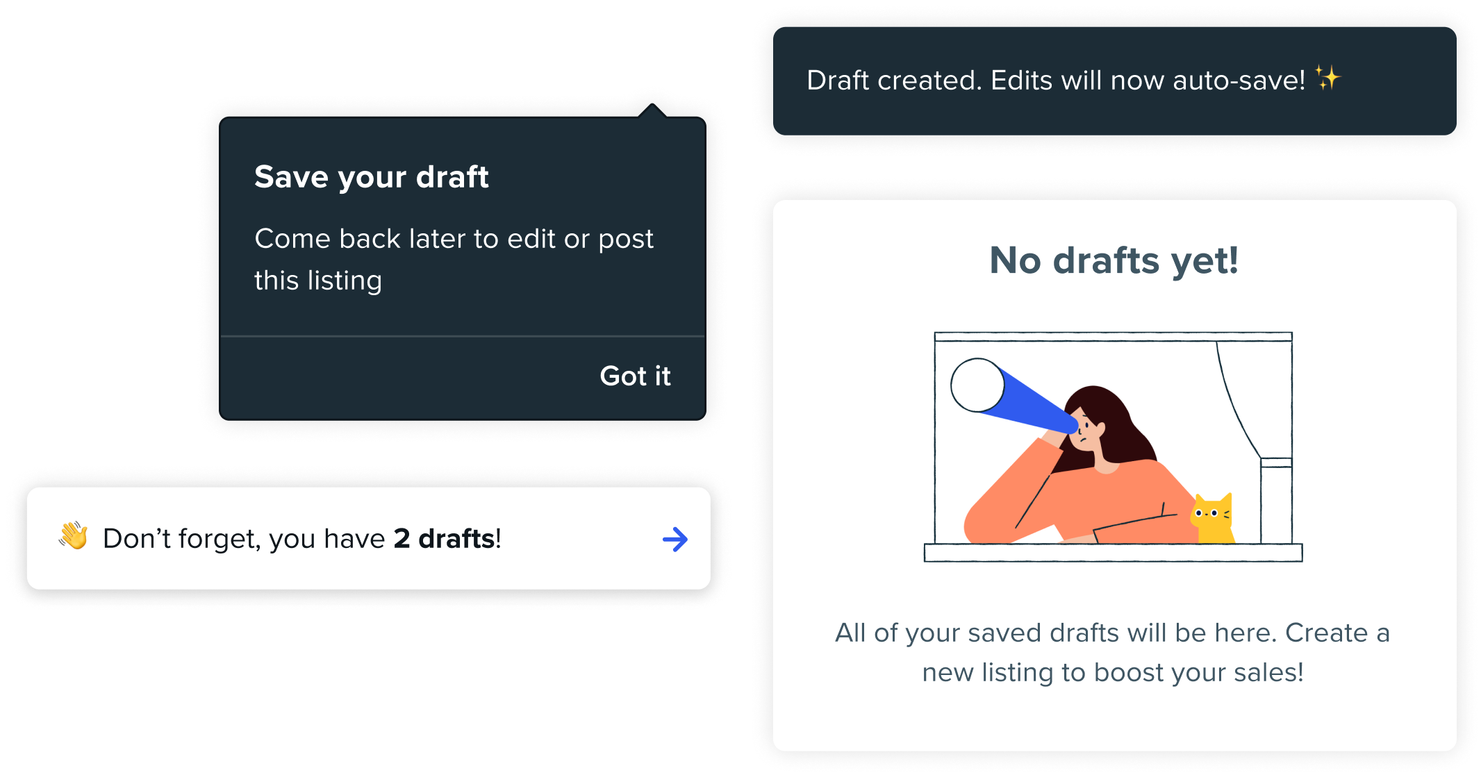
UX Copy driven design
I worked closely with my UX Writer to ensure the copy was being leveraged to clearly introduce and narate the draft feature to existing and new sellers on the platform.
We achieved this through the use of simple phrasing and contextual placement, while highlighting the value prop of the draft feature to sellers.