dutchDesign2019 is a website that encapsulates the experience of a design-focused field school program - includes 16 interviews with Dutch designers and visual anecdotes of the team's experience in the Netherlands.
Peep the website for optimal viewing experience at 2019.sfudutchdesign.ca
Overview
Role
UX Design, Visual Design, Interviewing, Videography, Video Production
Tools
Adobe Premiere Pro, Figma
Context
I had the opportunity to participate in an 8 month-long experiential field school program where our dope team of 12 students travelled across the Netherlands to learn and document the Dutch design culture, and to understand design as a contextually-driven, cross-disciplinary approach.
IDEATION
Design Principles
Prior to delving into visual design, we synthesized design principles that captured our team's goals, dynamic and, how we defined our collective selves:

Visual Design
Traditionally, past field school websites placed an importance on the designer interviews, highlighting it as the encompassing hallmark of field school. However, our team felt strongly about portraying the dutchDesign2019 website beyond the constraint of designer interviews - highlighting the experiential and cultural learning exchange which often gets overlooked. As a result, we synthesized the idea of an abstracted calendar to create a more rounded portrayal of our experience.
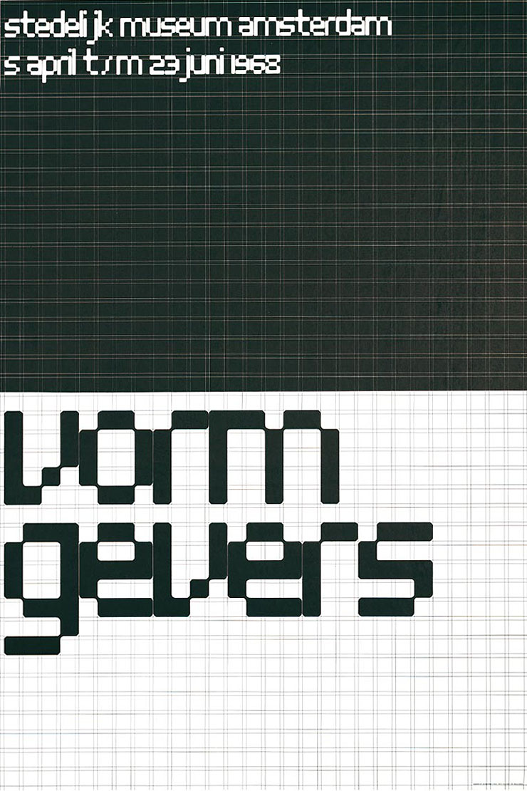
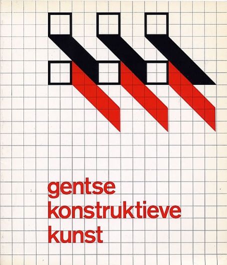
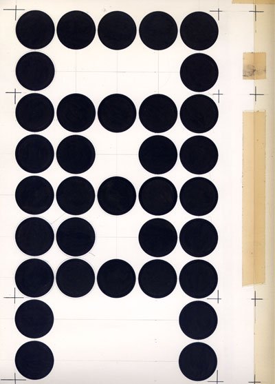
With the design principles in mind, we explored visual approaches that would complement the abstracted calendar metaphor and the content we produced. We were inspired by the dutch designer, Wim Crouwel- his virtue of functionalism that prioritizes practicality, clarity, and simplicity over artistic ornamentation. This implored the exploration of grids, simple shapes, and contrasting typography.


UX + Interaction Design
With our well defined design principles and a visual approach in mind, we worked to explore ideas and translate our vision into a website. Through a lateral process of ideating and user testing, we constantly iterated on the website to work out the interactions and finer details. During user testing we found ourselves needing to constantly tweak the website to meet the audience's expectations and to follow good UX practice. While it is important to reduce frictions and aim to produce an intuitive experience, we took an unapologetic stance towards our design decisions, uncompromising of our identity. The result was a website that embodied our design principles of experimental, unapologetic and ambiguous.
Glimpse Into Their World
Our goal with the homepage was to entice the viewer as if they were stepping into the designer's studio. We did this by surfacing full-bleed video portraits on hover, which would immediately give the viewers a sense of who the designer is. This also incentivizes viewers before committing to watching the interview.
Films + Field Notes
We utilized the calendar metaphor to lay out the films and field notes in the chronological order we experienced it. The duo shaped circles were used to divide the content between designer interviews and our field school anecdotes. The toggle feature allows the viewer to swap between the two content states where the circles change in size.
Field School Legacy
Past field school websites hosted an archive of interviews linking out to their respective websites. This year, we wanted to showcase past years' brand and their unique quality; This was our way of showing appreciation and acknowledging the privilege we have of being a part of this legacy program.
Our challenge was to create a cohesive experience which was in line with our visual identity while also allowing each year to have its own voice. This was achieved through a hover interaction that revealed their identity.
Videography
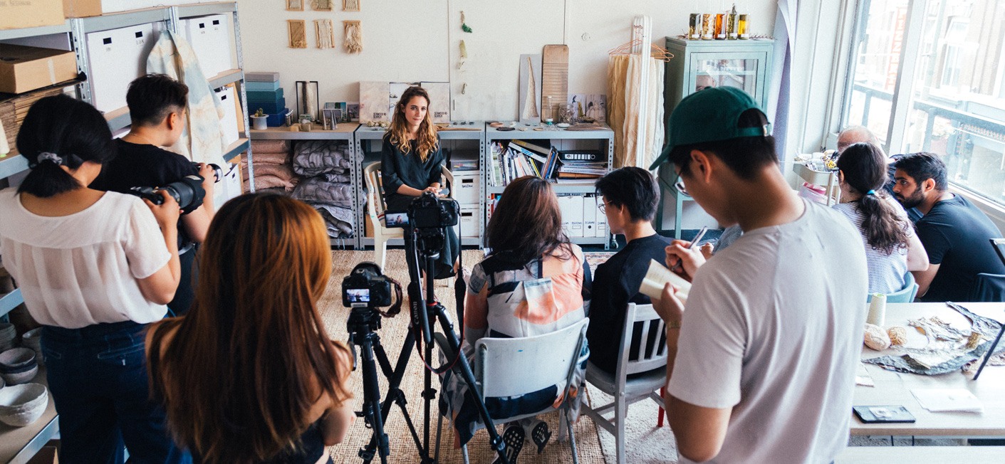
Having had minimal experience in videography and production prior to field school, I challenged myself to learn how to shoot and craft a compelling visual narrative. I had the humbling opportunity to research and interview the inspiring Nienke Hoogvliet, and produce short video that explains her philosophy and approach.
