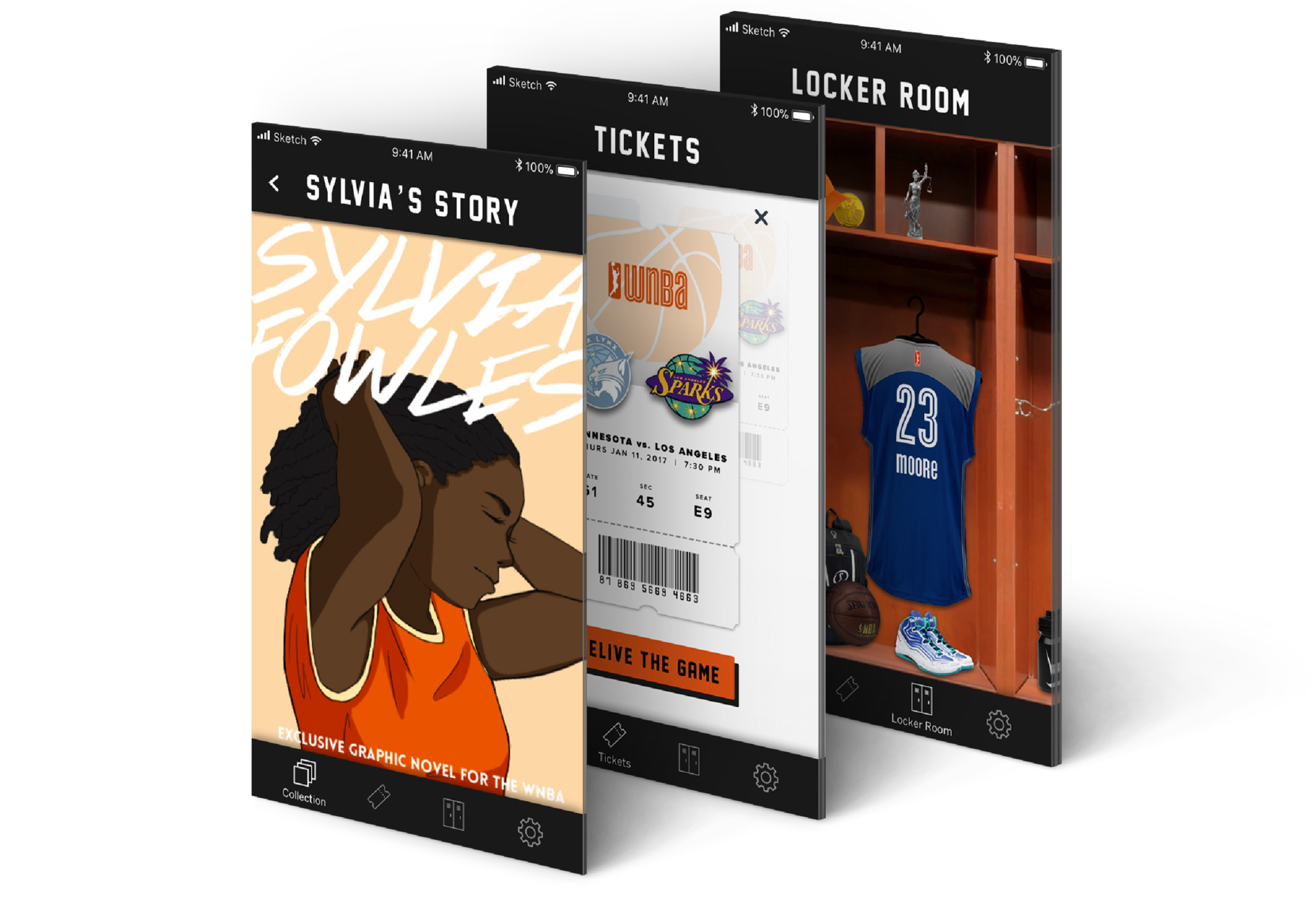
My WNBA is a mobile application that uses digital collectibles to increase engagement between young fans and the Women's National Basketball Association. My WNBA aims to foster a positive fan base culture that is grounded in empowering WNBA players.
Overview
This was a 4-week academic case study for a senior experience design course. For this project, we were tasked with finding a client with a business problem that was within the scope of the project constraints, where we as designers could come up with a meaningful digital intervention.
Team
Phoebe Lim, Jenny Nguyen, Christy Lum, Jessica Huang, Nikita Tauro.
Role
I conducted research, contributed to the product strategy, and helped create low-high fidelity mockups (pen & paper + Sketch) for specific user flows. For the design sprint, I took upon the responsibilities of the facilitator, ensuring that we iterated quick in a lateral process.
In August of 2019, NBA announced a partnership with Dapper Labs and introduced NBA Top Shot that allows game attendees to own player highlights in the form of blockchain based collectibles.
RESEARCH
Business Problem
Attendance and viewership of Women's National Basketball Association games has been on a steady decline since 2002, making it increasingly hard to survive as an organization.
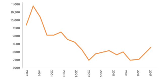
WNBA game attendance between 1997 - 2017
People Problem
WNBA games is commonly perceived as unentertaining and boring, often in comparision to NBA. Our team explored ways to change this perception and help grow WNBA's audience and increase engagement with both existing and new audiences.
PROCESS
Research and Insights
To gain a deeper understanding of the problem area, we conducted interviews with basketball coaches, a sports editor and basketball enthusiasts. We also looked for examples of what similar fields were doing to build audiences and maintain viewership.
01. Celebrating Individuality
The NBA is largely successful because of their ability to make players into celebrities. The NBA has certain household names that are prevalent not only because they play well, but are also relatable outside the court, and have big, entertaining personalities. Rather than only being perceived as a team sport, we asked ourselves, how might we celebrate the individuality of the WNBA players?
02. Cognitive Overload
The current website has no content strategy making it harder for a fan to engage with the players. This creates barrier to information that should be accessible and simple to digest.
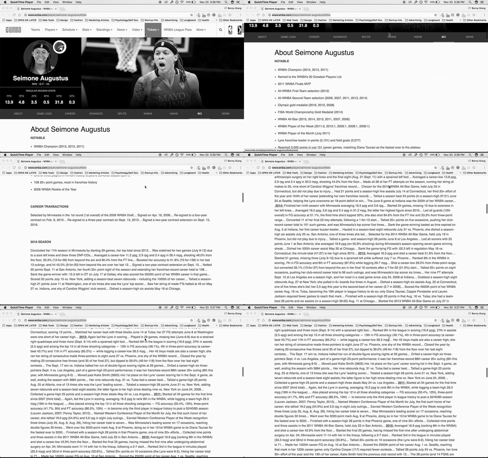
WNBA player profile with large walls of text
03. Meaningful Value for Existing Customers
During our primary research we found that tickets to the WNBA games are relatively cheap and encouraged to be bought in groups. This is why many families attend the games as an affordable form of entertainment. With an already existing audience, I advocated to the team the opportunity to target a younger demographic through an intervention that is engaging & relevant which would create a stronger bond with the players.
Connecting With Players Through Live Games
We attended an N.C.A.A. basketball game, to gain an additional understanding of the live game experience and to debunk any assumptions made through our secondary research. The game attendees ranged from university students and parents to little league players.
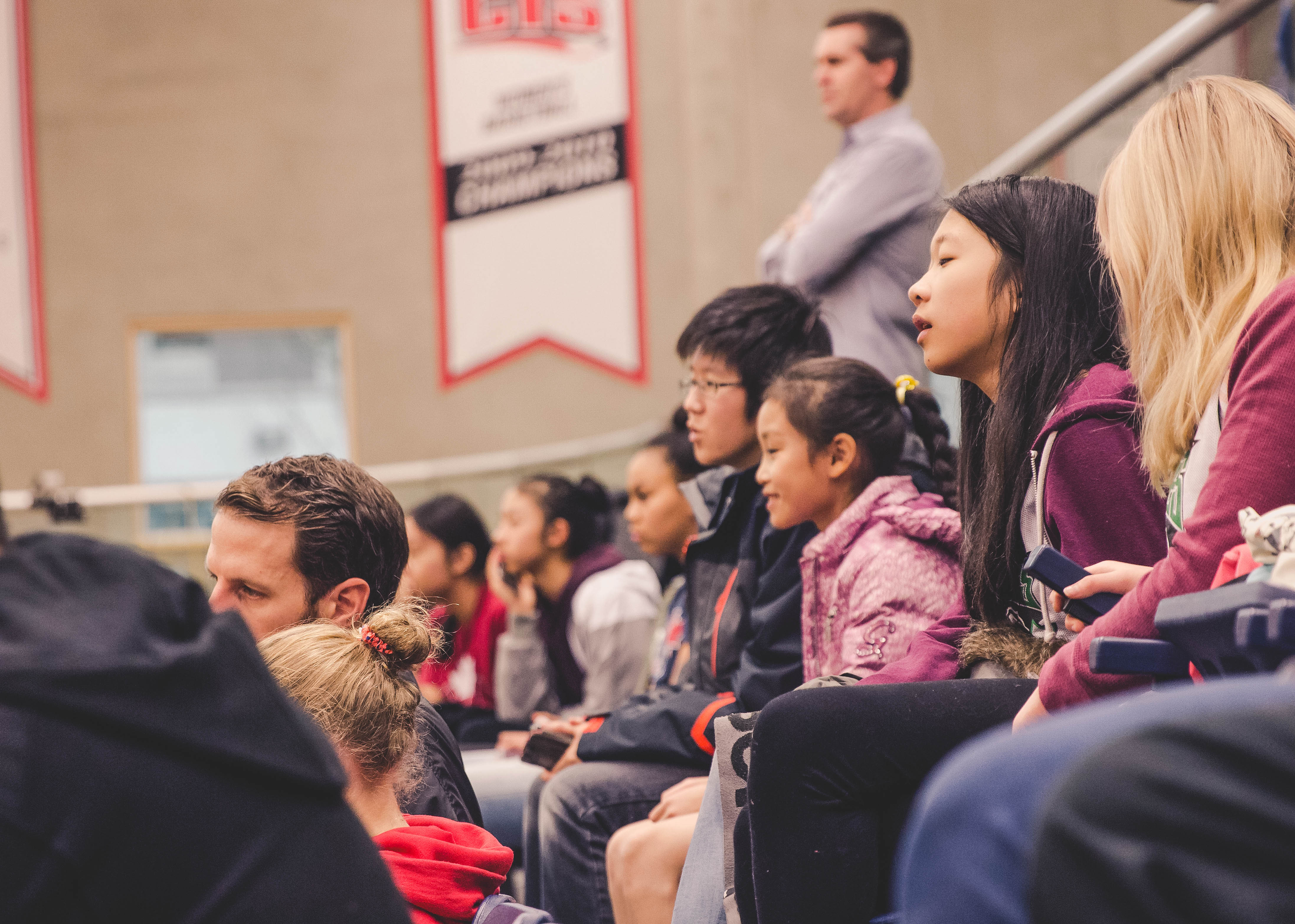
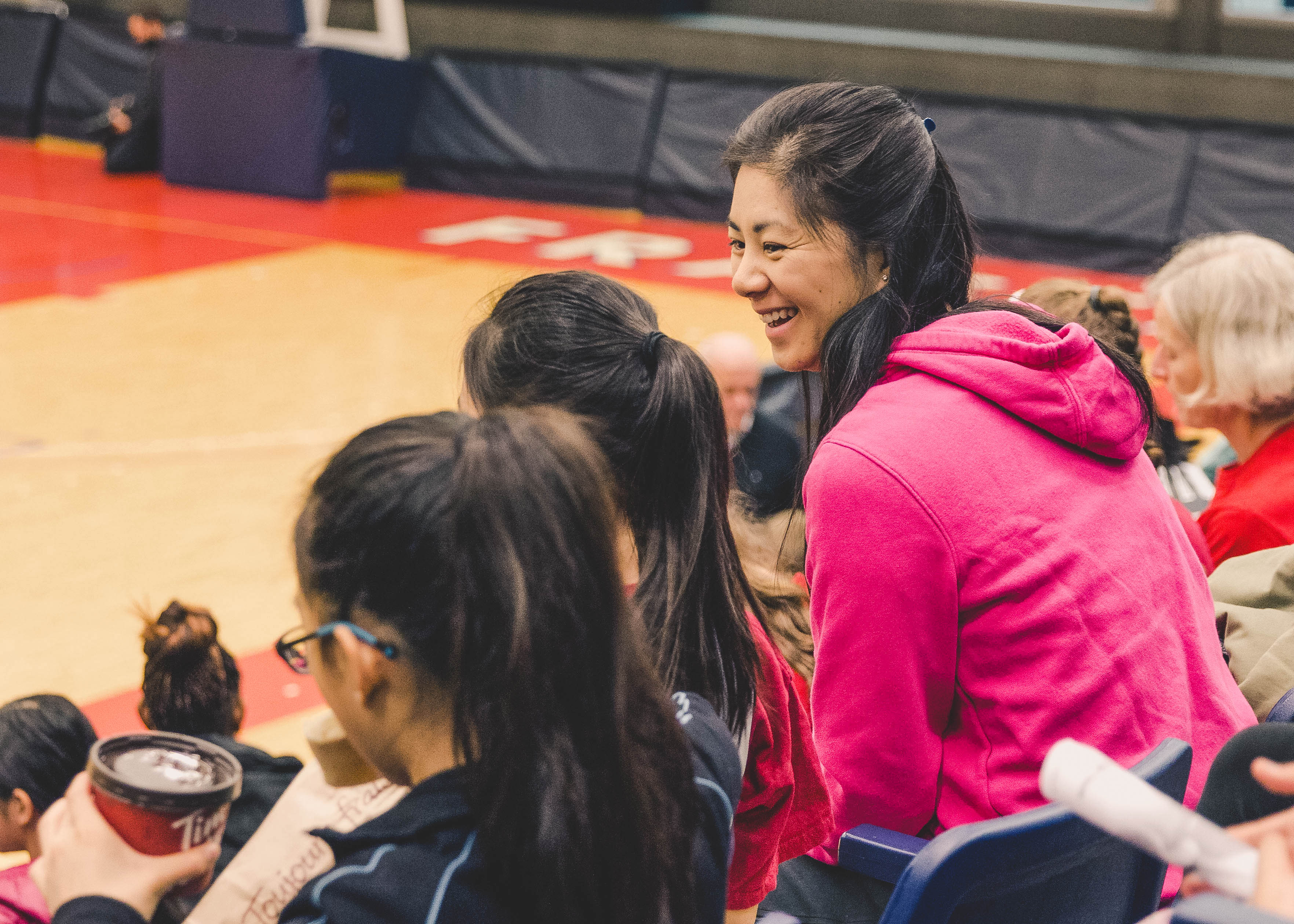
Photos of attendees from the N.C.A.A game
We observed an interesting behaviour where the attendees would read the team roster handout before the game started and during the game to identify the players that stood out to them. We saw this as an opportunity to familiarize the players to the audience . We also noticed a drop off in engagement after the game ended and saw the potential to create a more permanent experience beyond the live game experience. Designing for a cyclical journey rather than a linear one, would ensure repeat engagement with the WNBA and encourage families to attend more games in the future.
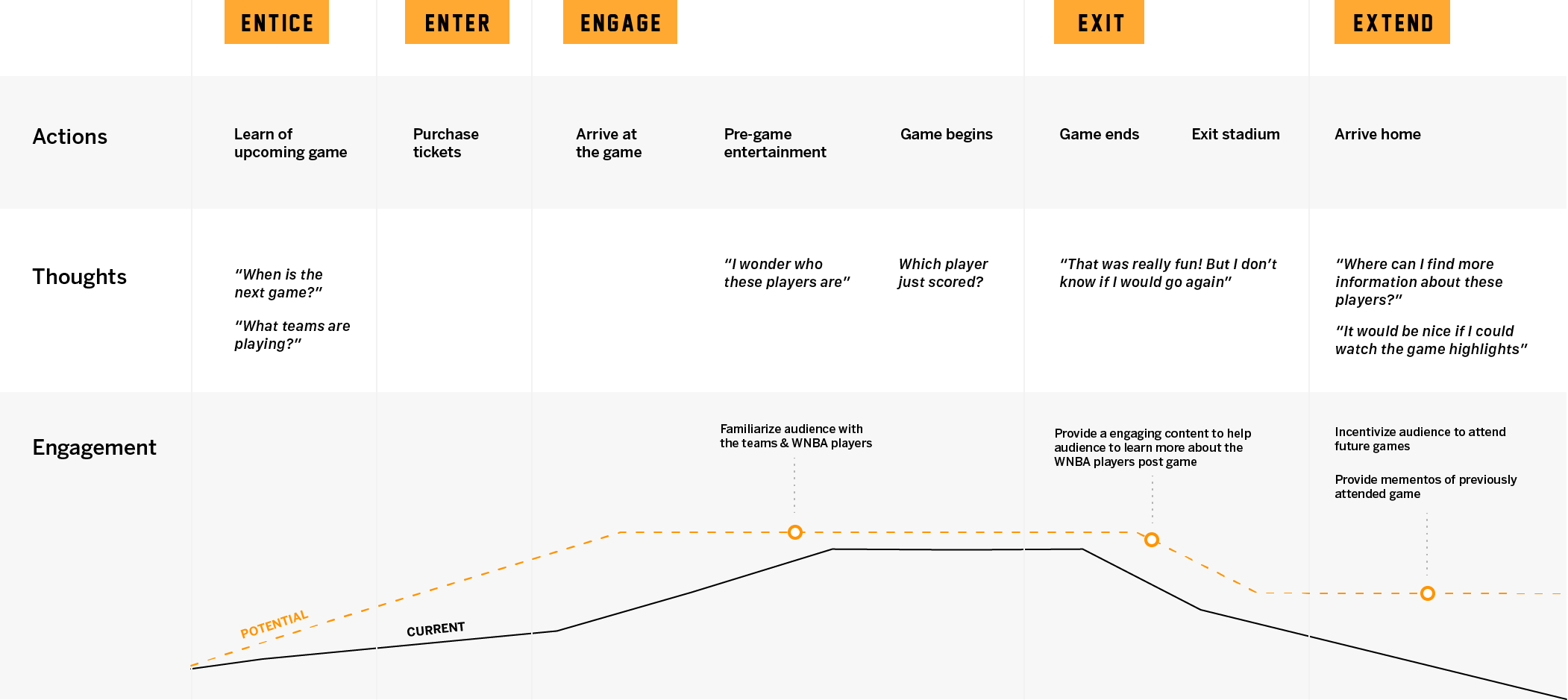
Journey map of a rookie fan attending a WNBA game and points of opportunities for us
Reframing for Longterm Impact
Based on our insights, we found an opportunity to cater our intervention towards an existing audience. We decided to target a younger audience between the ages of 9 and 14, because they have not yet formed solid opinions about the WNBA. We targeted the younger viewers that we considered are rookie fans, or those who are interested in the WNBA, but have not committed to the league. We chose the age group 9-14 years old because we wanted to ensure they were old enough to use or have their own mobile device.
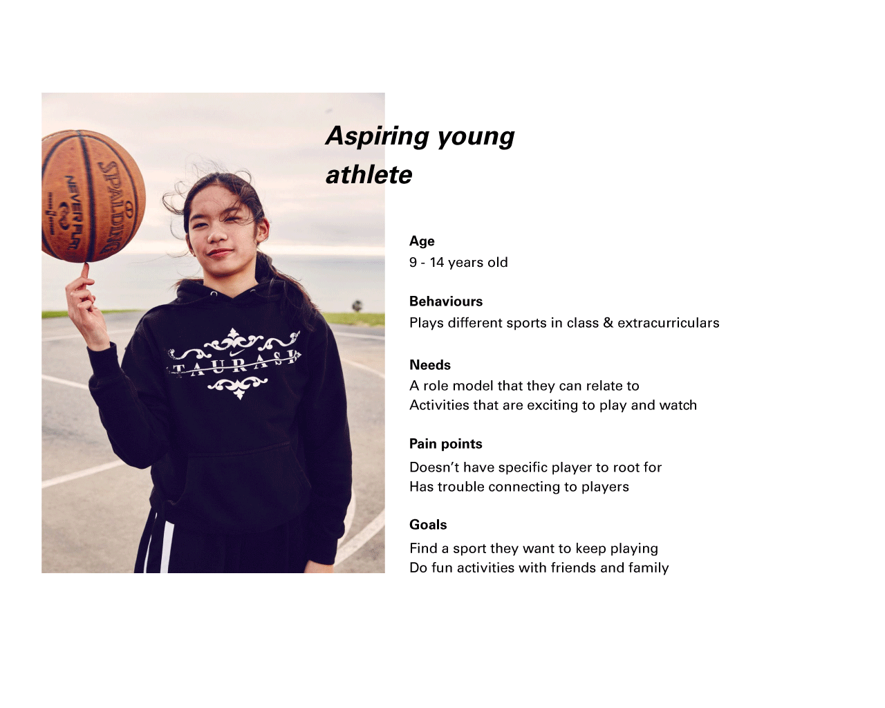
We reframed out initial goal of increasing ticket sales to designing an experience with a longterm impact and engagement with the WNBA culture. We summarized our end goal to be,
Highlight each player, their skills, and their stories outside of basketball to foster a stronger connection between them and the rookie fans.
IDEATION
Taking Concept to Form
With our end goal set, we conducted a week long design sprint where we were able to generate form ideas, create our prototype and conduct user testing. We looked for ways to intervene before and the after attending a live WNBA game. I took upon the role of a facilitator, ensuring that we kept our workflow at a rapid pace, fleshing out every form possible before converging into a polished idea.
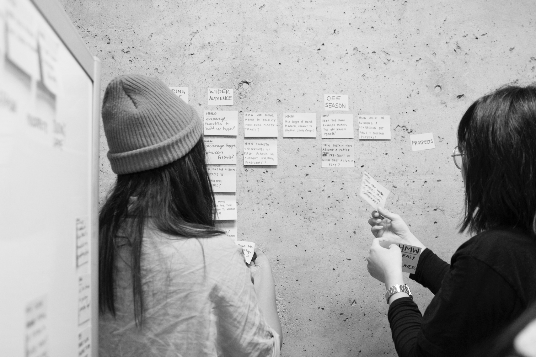

Brainstorming for How Might We questions to help us scope our form ideas.
By the end of the sprint, we settled with the idea of a mobile application that follows a narrative that ties into the context of attending a WNBA game; the interactions are divided into pre-game and post-game experiences.
Use digital collectibles to create an added value to WNBA games, encouraging seasonal game attendance and fostering a closer connection with the players.
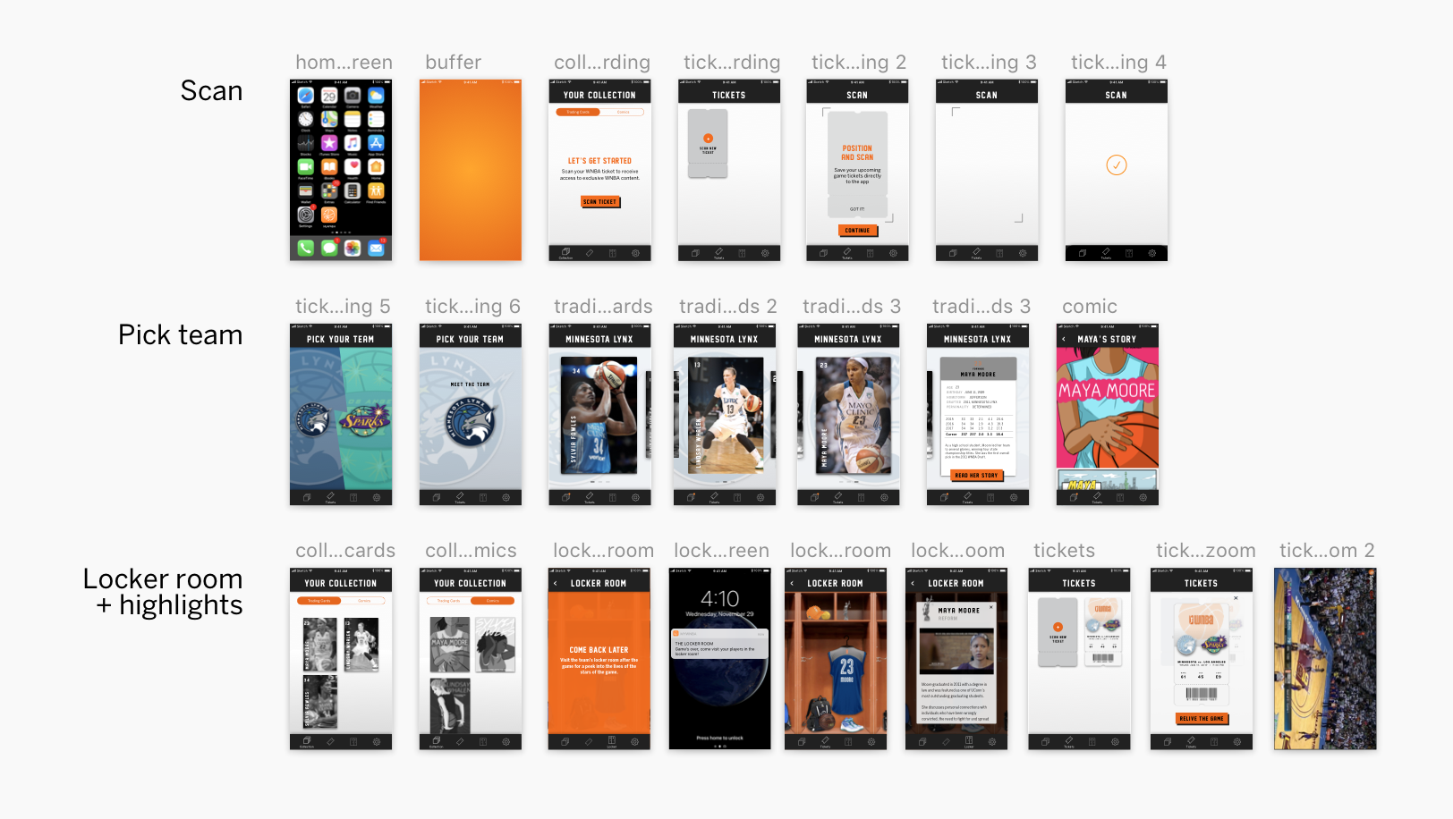
To encourage game attendance and to foster a stronger relationship with the WNBA players, we created an application where fans accumulate digital collectibles with every game they attend, that serves as both, mementos of the game and tangible connections to the players. These collectibles will feature items the portray the lives of the WNBA players outside of basketball. The overall experience with MyWNBA follows a narrative that ties into the context of attending a WNBA game; the interactions are divided into pre-game and post-game experiences.
Promotional video I helped put together for our proposal
User Testing the Prototype
While working on our prototype, we were simultaneously user-testing to validate or disprove features and value of the application. We were fortunate to test the prototype with 7 children between the ages 9 -14 and 4 parents that fit our persona. From our user-testing, we came away with the following takeaways:
01. The graphic novel was our users’ favourite component of the app experience. They felt it was joyful, personable and favoured it over just reading text.
02. Users in this age group don’t buy things online, via an app. So we eliminated the option to make in-app merchandise purchases.
03. Social causes the players support were more important to the parents, than to the young athletes. We decided to make it a more subtle part of interface.
Pitch video for MyWNBA
PRE-GAME
Collecting trading cards
After scanning their ticket, the rookie fan is prompted to a pick a team they support where they will receive 3 trading cards. The more games the rookie fan attends, the more cards they collect.
Trading cards are a popular symbol in sports, and a convenient way to chunk content. It also afford a familiar interacting of flipping cards.
PRE-GAME
The Underdog story
Each trading card provides access to an interactive comic about their lives before entering the WNBA.
We used the medium of an interactive graphic novel as a way to make storytelling more interesting for the younger audience, to paint a picture of the athletes' underdog story.
POST-GAME
Locker room
Post game, a notification informs the fan that the locker room has been unlocked. Through locker items, we highlight the players’ contributions in the social sector, focussing on what they advocate for outside of basketball.
The locker room is a commonplace for many young fans as they may also interact with their peers in this familiar setting. We intentionally replicated the locker room aesthetic to create a place where they feel emotionally engaged with the players.
POST-GAME
Relive the game
Rookie fans can "relive the game" by watching highlights of the game they attended. We decided to showcase game highlights to allow fans to remember integral parts of their live experience to validate their connection with the players.
Closing Thoughts
The intent of MyWNBA is to cultivate a strong relationship between new fans and the players. As fans acquire new digital collectibles with every game attended, we are increasing the likelihood of return game attendance. In addition, the app is another touchpoint where fans can interact and engage with the WNBA, even after the game has ended. The various components of the app reveal different sides of the WNBA players, from their humble beginnings, to their athletic prowess and social involvement. MyWNBA presents the players as admirable figures, inspiring and empowering young athletes.